I received an email about an order I had placed with an online store of a big-name consumer electronics brand with a link to track my shipment.
However, the track shipment page looks like this:
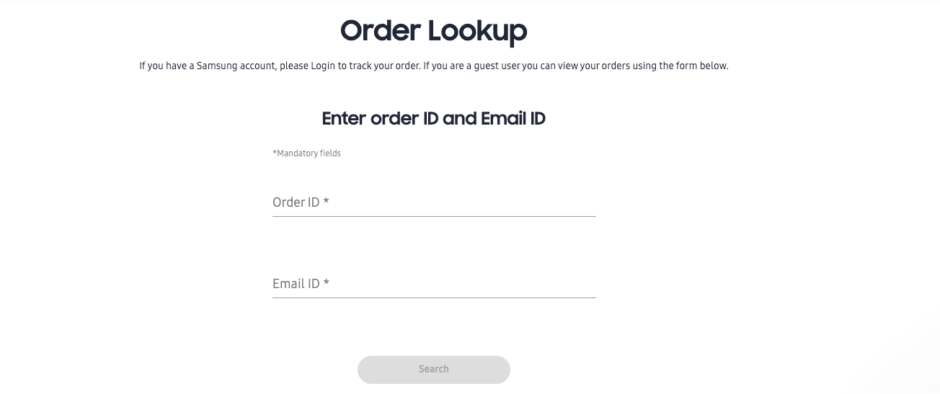
No. I do not not want to look up my order, rather, I want to track it.
And, no, I do not want to dig through my email to find my order number.
Given the convenience I am used to, form other digital stores, a first prize would be for the hyperlinked track order button contained in the order details email sent to me to resolve to an actual order tracking page with actual details/status of the order.
The execution above is not short of causing ‘customers pain’. It robs customers (at least it did in my case) the joy that accompanies the receipt of information about one’s order. Whilst this may not be enough to stop a customer from patronising next time, it is still important for those who design customer facing experience to consider making such experiences as seamless and as enjoyable as possible for the customer.
Customer/user experience is beyond beautifully crafted interfaces, it goes to the art of creating enjoyable experiences as customers interact with your business (and your products).